
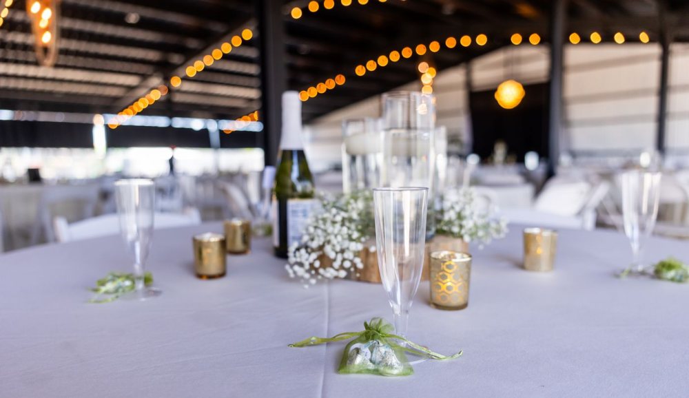
There is a particular kind of happy overwhelm at the very start of planning a wedding. You open one saved photo, and it leads to fifty more, and by the end of the evening you have a folder full of flowers, tablescapes, and dresses that you love and cannot quite make agree with one another. The good news for 2026 is that they do not have to. The mood this year is less about following the rules of what a wedding is supposed to look like, and more about landing on something that looks unmistakably like the two of you.
That shift is real and worth naming. In its 2026 wedding report, Pinterest described couples pinning billions of ideas and moving, in the aggregate, away from one-size-fits-all traditions toward celebrations designed around personality rather than convention. You can feel it in the palettes rising to the top too, which are warmer, moodier, and more personal than the safe neutrals of a few years ago.
This is a roundup to steal from, not a rulebook. Below are the trends shaping 2026 and five colour palettes worth falling for, with what each one feels like, where it shines, and a note on how to carry your colour all the way through to the pieces your guests actually see.
The short version
- 2026 leans personal. The strongest theme is celebrations that look like you, not like a template.
- Colour is having a moment. Think warm, layered palettes: olive and wood, berry and copper, terracotta, emerald and gold, soft mauve.
- Smaller guest lists and considered, less disposable choices are quietly everywhere.
- Multilingual and multicultural weddings are the norm, not the exception, and the details should keep up.
- Once you pick a colour you love, you can carry it through to your wedding website and your invitation, so the whole thing feels like one celebration.
The mood of 2026: personality first
If there is a single idea under everything this year, it is permission. Permission to skip the parts of a traditional wedding that never felt like you, and to lean hard into the parts that do. That might mean a first dance that is actually your song, a menu that is your grandmother's recipes, a dress that breaks with what the magazines expect, or a colour palette pulled from the place you fell in love rather than from a chart.
You do not need a wildly unconventional wedding to be part of this. A very classic day, chosen on purpose because it is what you both want, is just as personal as a jazz-club reception. The trend is not novelty for its own sake. It is intention. Everything that follows, the colours especially, is easier to choose once you decide what you want the day to feel like first.
Colour palettes to fall for
Colour is the fastest way to give a wedding a feeling. Here are five palettes carrying real momentum into 2026, each with the mood it sets and the kind of celebration it suits best.
Olive green and warm wood
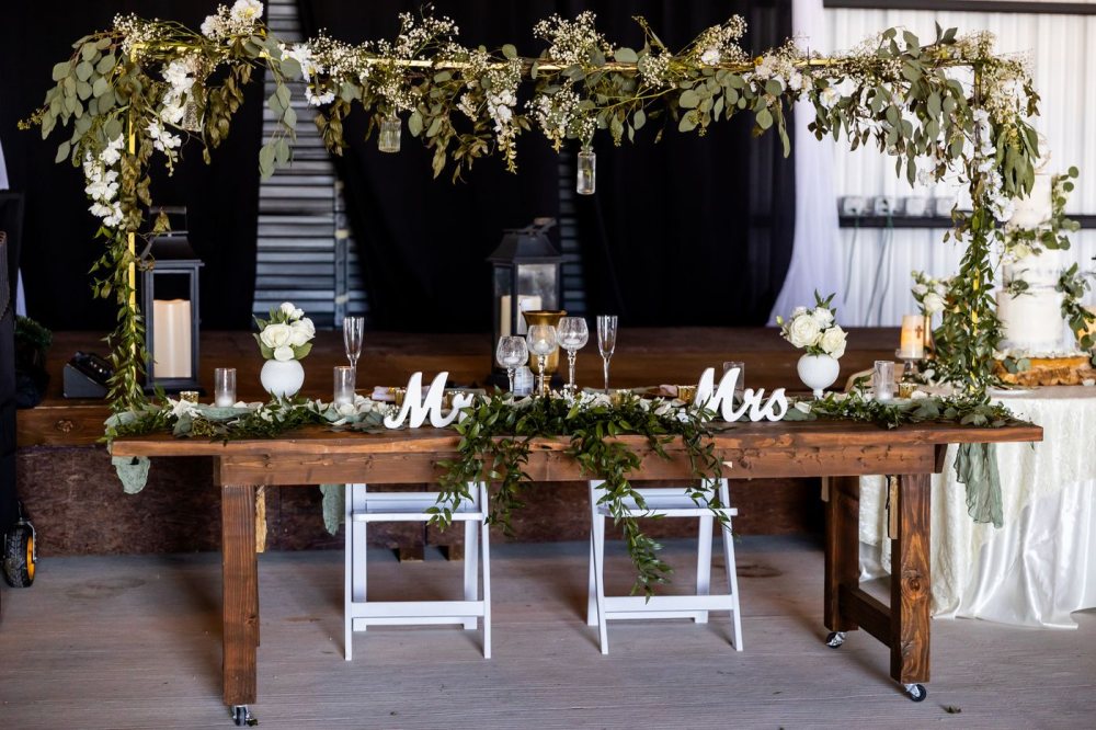
Soft olive and eucalyptus against the honey of bare wood, with cream and white to keep it fresh. This is the most relaxed palette here, and the most forgiving. It reads as effortless even when it took real effort, and it plays beautifully with greenery you can get almost anywhere.
Where it shines: outdoor and daytime weddings, long farmhouse tables, spring and early autumn, and any celebration that wants to feel gathered and unfussy without looking thrown together.
Burgundy, blush and copper
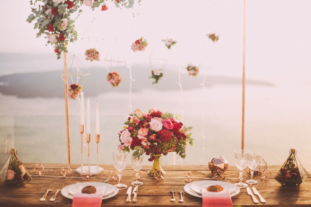
Deep berry roses softened with blush, warmed by copper and low candlelight. This is romance with a little drama, the kind of palette that looks best as the light drops. Pinterest flagged plum and berry tones as rising interest for 2026, and it is easy to see why: they feel rich without tipping into heavy.
Where it shines: sunset ceremonies, autumn and winter dates, evening receptions, and couples who want warmth with a bit of depth rather than something sweet and pale.
Terracotta and charcoal
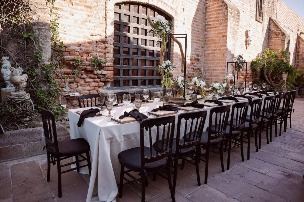
Sun-warmed clay and old brick, cream linen, and the graphic calm of charcoal and black. Muted terracotta was among the palettes Pinterest reported rising for 2026, and paired with black it turns from rustic into something more editorial. This is warm without being soft, which is a hard and lovely balance to strike.
Where it shines: courtyards and stone venues, Mediterranean and desert settings, and couples who love warm earth tones but want an edge rather than a country-cottage feel.
Emerald green and gold
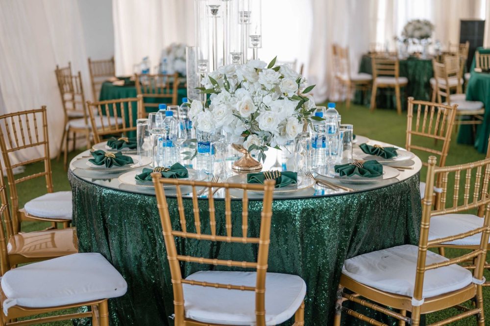
Jewel-deep green, gilded chairs, and generous white flowers. This is the most dressed-up palette here, and the most celebratory. It fills a big room with colour and looks especially at home when the guest list is large and the point of the night is a full, joyful hall.
Where it shines: grand evening receptions, ballrooms and marquees, and the many multicultural celebrations where richness and a little gold are exactly the language of the day.
Mauve, lilac and pearl
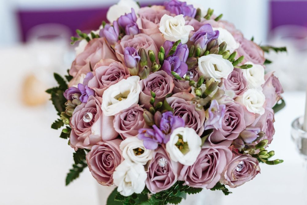
Dusty mauve roses, soft lilac, and a pearly white sheen. This is the gentlest palette on the list, romantic and a little dreamy, and it nods to the soft, opalescent mood that keeps surfacing in 2026 inspiration. It photographs beautifully in daylight and never feels loud.
Where it shines: spring weddings, garden parties, morning and afternoon celebrations, and anyone drawn to something tender rather than bold.
Tip
Pick two colours to lead and let one be your quiet neutral, then repeat that trio everywhere, in the flowers, the linens, the invitation, and the site. Consistency, not quantity, is what makes a palette look intentional instead of busy.
A few more trends worth watching
Colour is the fun part, but a handful of quieter shifts are shaping how couples actually plan in 2026.
Weddings that speak more than one language
More families are gathering across countries and languages than ever, and the best celebrations simply plan for it. That means an invitation your grandmother can read in her own language, signage and a website that do not leave half the room guessing, and details chosen from more than one tradition on purpose. If your guest list spans, say, English, Arabic, and French speakers, the kind thing is to meet each of them where they are. It is a small effort that guests remember.
Smaller guest lists, deeper attention
The long, quiet trend toward more intimate weddings is holding. Fewer guests is not about doing less. It is about spending the same care on eighty people instead of two hundred and fifty, which usually means better food, real conversations, and a day that feels like a gathering rather than a production. If that is you, it changes your palette choices too. Softer, warmer schemes tend to suit a smaller room.
Considered, not disposable
Couples are asking more often where things come from and where they go afterwards. In practice that looks like seasonal and local flowers, rented tableware, a dress that will be worn again or passed on, and fewer single-use props. None of it has to be austere. A considered wedding often looks richer, because the money goes into a few things that matter rather than a hundred that do not.
The small, analogue touches
Alongside all the planning tools, 2026 has a real soft spot for handmade keepsakes and low-tech charm. Pinterest reported rising interest in things like written songs, guest activities, and even the humble photo booth. These are the details guests talk about later, and they cost more thought than money.
Carrying your palette all the way through
Here is the part that is easy to forget. A palette only feels finished when it reaches the pieces your guests actually hold and open, not just the room on the day.
This is where a little of what we do at Laylaty fits in. When you build your wedding website, you choose a colour for it, and that colour carries across the whole site, the buttons, the accents, and the small dividers between sections, so it looks like your wedding rather than a stock template. Choose burgundy, plum, sage, or charcoal, and the site follows.
Your invitation is designed too, not a bare reply form. Your names, your date, your colour, laid out properly on a card. And because so many guest lists now span more than one language, your invitation and site can be read in several, including Arabic set right to left and French, so nobody is squinting at a page they cannot fully follow.
Tip
Decide your two lead colours before you build anything, then match your website colour and your invitation to them. Choosing once, up front, saves you redoing the pretty parts later.
Choose the feeling first
If you take one thing from all of this, let it be the order of operations. Decide how you want the day to feel, pick the palette that carries that feeling, and let everything else fall in behind it. The trends are only useful as permission, not pressure. A wedding that looks like the two of you, in colours you genuinely love, will always outshine one that simply followed the year's rules.
When you are ready to make it real, start with your colour and your invitation, and let the rest of the celebration gather around it.